Blog

  • awesome-lego-machine-learning

    Awesome LEGO Machine Learning

    A curated list of resources dedicated to Machine Learning applications to LEGO bricks.

    Parts Classification

    Applications

    Sorting Machines

    Other projects

    • JetClean [2022.10] – JetClean is a small robotic Lego cleaner capable of autonomously navigating around your bedroom and keeping it tidy!

    Code

    • Setognize [2024.06] – Code for a mobile app that can recognize 50 dfferent Lego sets.
    • LegoSorter [2023.09] – Code for a mobile app that can recognize and count Lego bricks. It includes scripts for rendering the dataset, training the model, and the backend for the app.
    • OpenBlok [2022.11] – OpenBlok is an open-source Lego identification and sorting system using AI models developed by blokbot.io
    • Lego Brick Recognition [2020.03] – Code for generating synthetic dataset and training a classifier for 15 different parts.
    • Lego Classifier [2019.08] – Detailed description of training a part classifier and deploying it on Arduino.
    • Lego Detector [2019.03] – Code for training a classifer.

    Papers

    Datasets

    Rendering Parts

    Understanding Part IDs and colors

    Generating Sets

    Papers

    Datasets

    Assembling Sets

    Papers

    Generating images of LEGO

    Models

    Posts

    3D Reconstruction

    Papers

    Price Prediction

    Code

    ML at LEGO Group

    Other lists

    Visit original content creator repository
    https://github.com/360er0/awesome-lego-machine-learning

  • huffman-encode-decode

    Compression of Text using Huffman Coding

    Refer the medium article for a better understanding: https://medium.com/@asavinda/c-program-for-text-compression-using-huffman-coding-6625d31d9e43?source=friends_link&sk=834b8706a7852100070b9000786fc010

    This implementation has two seperate C programs. One will input a text file and will output a compressed version of the text file into two separate files. One is the .huffman file which has the content. The other file is .table file where it contains the huffman lookup table. The other program is used for decompression. This program inputs the above generated two .huffman file and .table file and will output a .txt file.

    This method of coding was introduced by David A. Huffman In 1951. while he was a Ph.D. student at MIT. He was given the task to find an efficient way of coding and came up with the idea of using a frequency-sorted binary tree and proved this method to be the most efficient. He published a paper in 1952 titled “A Method for the Construction of Minimum Redundancy Codes“.

    Huffman Tree and Coding using Huffman

    Huffman tree is a technique that is used to generate codes that are distinct to each other. Using this method, most occurring symbols will get the least number of bits and others accordingly.

    1. Sort all the different symbols and their particular frequency or probability.
    2. Take the two lowest probability symbol and create a new common node with the probability equal to the sum of the two probability. Always make sure to add the lowest summing up nodes.
    3. Add the new node to the table instead of the lowest two symbols or nodes.
    4. Repeat step two and three until one symbol or node is remaining.
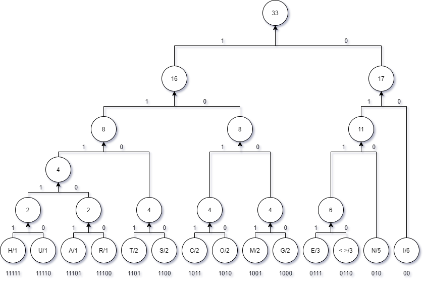
    5. Then allocate ‘0’ to all the right branches and ‘1’ to all right branches
    6. Read the bits from top of the tree to the bottom to each symbol and record their particular bit pattern

    A Practical Example

    Consider the following sentence.

    THIS IS COMMUNICATION ENGINEERING

    The following table represents the letters and their occurances in the above sentence.

    letter no of occurences letter no of occurences
    T 2 M 2
    H 1 U 1
    I 6 N 5
    S 2 A 1
    space 3 E 3
    C 2 G 2
    O 2 R 1

    For the above table, consider the following huffman tree. Arrange all the letters in ascending order in their frequency of their occurance. Huffman Tree Sample

    How to Run the code

    Compile both of the programs called huffman_encode.c and huffman_decode.c using GCC.

    gcc -o huffman_encode huffman_encode.c
    gcc -o huffman_decode huffman_decode.c
    

    After Compiling use the huffman_encode binary to encode or compress any given text file in .txt format. For example, if you input abc.txt file, this will output two separate files in the same directory with abc.huffman and abc.table extensions.

    huffman_encode abc.txt
    

    Use the huffman_decode binary to decode or decompress any .huffman and .table file. These two files are mandatory. The decoded file will be saved in a directory with extension .decoded

    huffman_decode abc.txt.huffman
    
    Visit original content creator repository https://github.com/adeesha-savinda/huffman-encode-decode
  • ansible-role-swap

    Ansible Role: Swap

    CI

    An Ansible Role that configures swap space on Linux.

    Requirements

    None.

    Role Variables

    Available variables are listed below, along with default values (see defaults/main.yml):

    swap_file_path: /swapfile
    

    The location of the swap file on the server.

    swap_file_size_mb: '512'
    

    How large (in mebibytes) to make the swap file.

    swap_swappiness: '60'
    

    The vm.swappiness value to be configured in sysconfig.

    swap_file_state: present
    

    If you wish to remove your swapfile, and disable swap, set this to absent. Generally you’d probably want to set this to present.

    swap_file_create_command: "dd if=/dev/zero of={{ swap_file_path }} bs=1M count={{ swap_file_size_mb }}"
    

    The command used to create the swap file. You could switch to using fallocate to write the swap file more quickly, though there may be inconsistencies if not writing the file with dd.

    Dependencies

    None.

    Example Playbook

    - hosts: all
    
      vars:
        swap_file_size_mb: '1024'
    
      roles:
        - geerlingguy.swap
    

    License

    MIT / BSD

    Author Information

    This role was created in 2018 by Jeff Geerling, author of Ansible for DevOps.

    Visit original content creator repository https://github.com/geerlingguy/ansible-role-swap
  • accent_rating

    Accent Rating

    This is a collection of scripts and data I used when working on my dissertation.

    Recording procedure (Praat directory)

    • recording_procedure.praat – this is the script I used for collecting the audio
      data (it’s a mess like most Praat scripts I’ve written, but it was good enough
      to do what I wanted)

    PsyToolkit (v3.2.0)

    • survey.sur – PsyToolkit survey for collecting metadata and running the
      experiment
    • rating_experiment.psy – The experiment itself
    • scale_l_to_r.txt – Code that draws a sliding scale in
      rating_experiment.psy with left-to-right orientation
    • scale_r_to_l.txt – Code that draws a sliding scale in
      rating_experiment.psy with right-to-left orientation
    • sounds.txt – List of audio files used in the experiment (audio files are not
      included due to license limitations)
    • bitmaps/ – Collection of pictures used in rating_experiment.psy
    • tables/ – Collection of sounds used in rating_experiment.psy. Each table has
      three columns: variable name, file name, duration

    EER measurements

    • measure_EER.py – script that draws DET curves and calculates EER values from
      the sid_results_table_individual_files_filtered.csv results table. Simply
      run python measure_EER.py. The script creates a folder named
      EER_measurements which contains temporary files to verify that same and
      different speaker labels are correct.
    • sid_results_table_individual_files_filtered.csv – different-sex recordings
      have been filtered out

    Language identification

    • phonexia_lid_wrapper.sh – wrapper for the Phonexia LID technology (this is
      mainly here to show which subset of languages was used in the analysis)
    • speechbrain_lid_wrapper.py – wrapper for the SpeechBrain LID technology it
      subclasses the EncoderClassifier to extract scores for English and Czech apart
      from the best-matching language (the audio files are not included due to
      license limitations so the script does not really produce the results!)

    Speaker identification

    • sid4_wrapper.sh – wrapper for the Phonexia SID4 technology. A simple helper
      script which extracts voiceprints from all wave files in one directory and
      then compares all voiceprints with each other. It also saves the amount of
      “net speech” in each voiceprint to a file.
    • speechbrain_sid_wrapper.py – a wrapper for SpeechBrain’s SpeakerRecognition.
      It has options for computing embeddings from audio files or loading previously
      created embeddings. It subclasses SpeakerRecognition in order to be able to
      perform verification on embeddings instead of on audio files.
      The script creates embeddings from all audio files in a directory and then
      performs speaker verification either on all combinations or all permutations
      of the embeddings set.

    Visit original content creator repository
    https://github.com/jakubbortlik/accent_rating

  • popchroma

    Pop Chroma

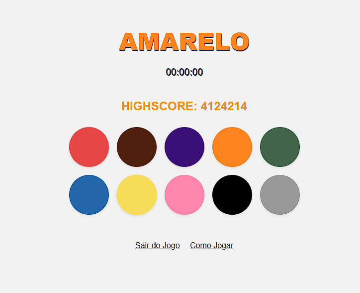
    Screenshot_2

    Um jogo simples e divertido para testar sua rapidez e percepção de cores.

    SobreComo JogarDemonstraçãoTecnologias UtilizadasLicençaContato


    Sobre

    Uma aplicação simples desenvolvida em HTML, CSS e JavaScript. O objetivo do jogo é clicar no botão cujo texto corresponde à cor exibida acima do botão. O desafio é que o nome da cor é exibido em uma cor diferente, então você precisa estar atento à cor real do texto, não ao seu nome.

    O jogo fica cada vez mais difícil conforme você acerta, aumentando a velocidade em que as cores são alteradas e o tempo para fazer a escolha correta diminui.

    Como Jogar

    1. Abra o arquivo index.html no seu navegador ou acesse a demonstração online aqui.
    2. Clique no botão “Iniciar” para começar o jogo.
    3. A cor e o nome da cor serão exibidos acima dos botões coloridos.
    4. Clique no botão com o nome da cor que corresponde à cor do texto exibida acima do botão.
    5. Se acertar, sua pontuação aumenta e uma nova cor é exibida. Se errar, ou o tempo acabar, o jogo termina.

    Demonstração

    Veja o jogo em ação aqui (link para a demonstração online).

    Tecnologias Utilizadas

    • HTML
    • CSS
    • JavaScript

    Licença

    Este projeto está licenciado sob a MIT License. Sinta-se à vontade para modificar e usar o código conforme necessário.

    Contato

    Para mais informações ou sugestões, entre em contato por e-mail em pscampos221@gmail.com ou visite meu site pessoal pscamposs.


    Visit original content creator repository https://github.com/pscamposs/popchroma
  • wsite

    Wsite

    This is the online source repository of Wsite, a lightweight and fully-customizable web server and service with a
    Java-powered backend.

    Important disclaimer

    In its current state, Wsite is only meant for testing and development-purposes only. Not recommended to
    use in production. That being said, a demo of it is being ran at http://whizvox.me

    How to run

    Requirements

    The following must be installed:

    If you are having any problems building or running, use Java 8, not Java 9+.

    Optional:

    Creating an executable Jar

    Run ./gradlew shadowJar. The result will be in ./build/libs/wsite-<version>.jar

    Run with Gradle

    Run ./gradlew run. The service will use ./rundir as the working directory.

    Quick-start guide

    • First running will result in a small setup service being hosted at localhost:4568/
    • Fill in (at minimum) the fields under Initial operator (the SSL and SMTP fields don’t do anything right now)
    • Submit the form, and the server will restart with the standard routes
    • Login at /login (logout at /logout)
    • Every route prefixed with /control will require an operator to be logged in.
    • Goto /control to view all available control options

    Visit original content creator repository
    https://github.com/whizvox/wsite

  • RustyLock

    Rust-based Ransomware

    This Windows ransomware example is written in 100% Rust. This code encrypts all files that the computer can read and write under the User directory.

    How to Use

    To use the ransomware, you will need to compile it from the source. Here are the steps to do so:

    1. Clone the repository to your local machine: git clone https://github.com/kuzeyardabulut/RustyLock.git

    2. Install Rust on your machine if you haven’t already. You can download Rust from the official website: https://www.rust-lang.org/tools/install

    3. Navigate to the project directory and compile the code:

    cd RustyLock
    cargo build --release
    1. Once the code is compiled, you can run the ransomware:
      ./target/release/inject.exe

    2. The ransomware will encrypt all files in the User directory and its subdirectories with the AES algorithm.

    Working Flow

    This ransomware has been designed to encrypt files on a user’s system and demand a ransom for their release. Here’s how it works:

    1. Upon execution, the ransomware copies itself to the startup folder to ensure persistence across reboots.
    2. It then scans the user’s directory and subdirectory for files that have read-write permissions and creates a list of these files, which it saves in the /tmp/ directory. The ransomware then waits for the next startup.
    3. During the next startup, the ransomware reads the list of files saved in the /tmp/ folder and begins encrypting them. Even if the system is turned off during this process, no data loss will occur. When the system is turned back on, the ransomware will resume the encryption process from where it left off.
    4. Once the encryption process is complete, the ransomware creates a file named encoded.txt and awaits the next startup.
    5. During the next startup, the ransomware detects the encoded.txt file and begins to decrypt the system. Again, even if the system is turned off during this process, no data loss will occur.
    6. Once all decryption processes are complete, the ransomware and its traces are deleted to avoid detection.

    How it Works?

    Upon opening the .exe file, the program first runs the anti-debugger and check_process functions. If these anti-reversing functions are passed without error, an incognito window is created. In this window, the path of the current location of the .exe file is retrieved, and the file is copied to \AppData\Roaming\Microsoft\Windows\Start Menu\Programs\Startup. The .dll file in the same directory is also copied to the \AppData\Local\Programs\Microsoft Store folder. Essentially, this adds the .exe to the startup scripts of Windows, ensuring that the file runs each time the computer is turned on.

    In real Ransomware examples, running a .exe in startup scripts is not always advisable. Therefore, they can do some configuration for regedit, enabling the .exe to be run in the same way as startup scripts. However, to add configuration to regedit, the user must run the .exe as an administrator.

    Following these steps, the ransomware’s .dll file is injected into SecurityHealthSystray using the dll_syringe library. The .dll file activates many security functions, most of which are sourced from here. These anti-reversing functions are performed for a while and the program waits for their completion. If no issues are found during the check, the ransomware is launched.

    Initially, AES keys are defined. In real examples, keys are randomly generated and transmitted to the server side over the internet. Every time the program is opened and closed, the program communicates with the server side with certain security measures until the encryption is complete. All key exchanges on the server side and client side are conducted in an asymmetric encrypted manner, making it impossible to reverse engineer and find the key.

    Once the keys are created, directories are defined and the program starts. It first checks whether the system has been encrypted before by examining the \AppData\Local\Temp\encoded.txt file (in real examples, this is usually done by communicating with the APIs). If the system has been encrypted before, the program decrypts it using the decrypt_large_file function. Otherwise, the encrypt_file function is called to initiate the encryption.

    When these functions are called, the program checks whether the target function has previously been executed. If so, it resumes from where it left off; otherwise, it starts the target function from the beginning.

    Disclaimer

    This ransomware is for educational purposes only. Please do not use it for any malicious activities. The author is not responsible for any damages or legal issues caused by the misuse of this code.

    License

    This code is licensed under the MIT License. Please see the LICENSE file for more details.

    Contributions

    Contributions are welcome! If you find any bugs or have any suggestions for improvement, please create a pull request.

    Visit original content creator repository
    https://github.com/kuzeyardabulut/RustyLock

  • Facial-Recognition-Attendance-System

    Facial Recognition Attendance System using Deep Learning with Microsoft FaceAPI, Django and Raspberry Pi-es!

    GitHub issues

    F.R.A.S!

    No Longer Maintained – About to be rewritten.

    Guys, I am extremely sorry to say that the Django Server code is severely broken and needs a complete rewrite, I’ll be doing that really soon, so until then. Stay Tuned. 🤷🏽‍♂️

    Other than being a mouthful to say; FRAS allows tens of facial-recognition-camera-clients aka tiny Raspberry Pi-es to be deployed all across a college, or an industrial campus, which then record who they see and when they see then to a central database.

    The entire system runs for dirt cheap on cloud using Microsoft Face API, Heroku and AWS S3 and using multiple Raspberry Pi Zeros, which cost about 1517$

    How does it work?

    Dystopian node-based Facial Recognition in 5 simple steps.

    1. A Django REST Server, with a PostGres Database runs on Heroku.
    2. A 15$ Raspberry Pi Zero with a Camera Module and internet connection is placed at any location – entrances, exits, hallways
    3. The Raspberry PiCamera Client takes an image at regular intervals and sends this to Microsoft Face API, which tells who-is-who in the image.
    4. The Camera Client then sends the names of recognized persons to the REST Server for storage with the captured images which are sent to AWS S3 for storage.
    5. Angular Frontend allows users to view the stored data.

    This was my high school’s final semester project on which I barely spent 48 hours building. The REST Server and Angular proved to be quite an undertaking! But, the professor seems pleasantly surprised with what I built so it all ended just fine. 🙂

    Architectural Overview

    Basic Architecture

    arch-1

    Every Camera Client is responsible for recognizing all of the faces on it’s own and communicating with the Microsoft Face API as well as saving the images to S3, also the users connected to the Angular Client can also need to see the uploaded images, so everything ends up looking like this.

    arch-1

    User Interface

    Main Page

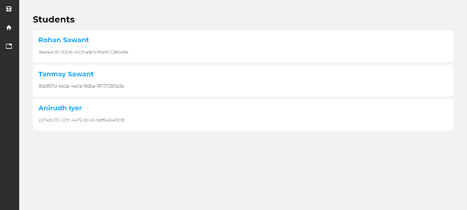
    The Main Page shows the list of all registered people, Face API is sent about ~20 images of each person during the initial setup.

    img

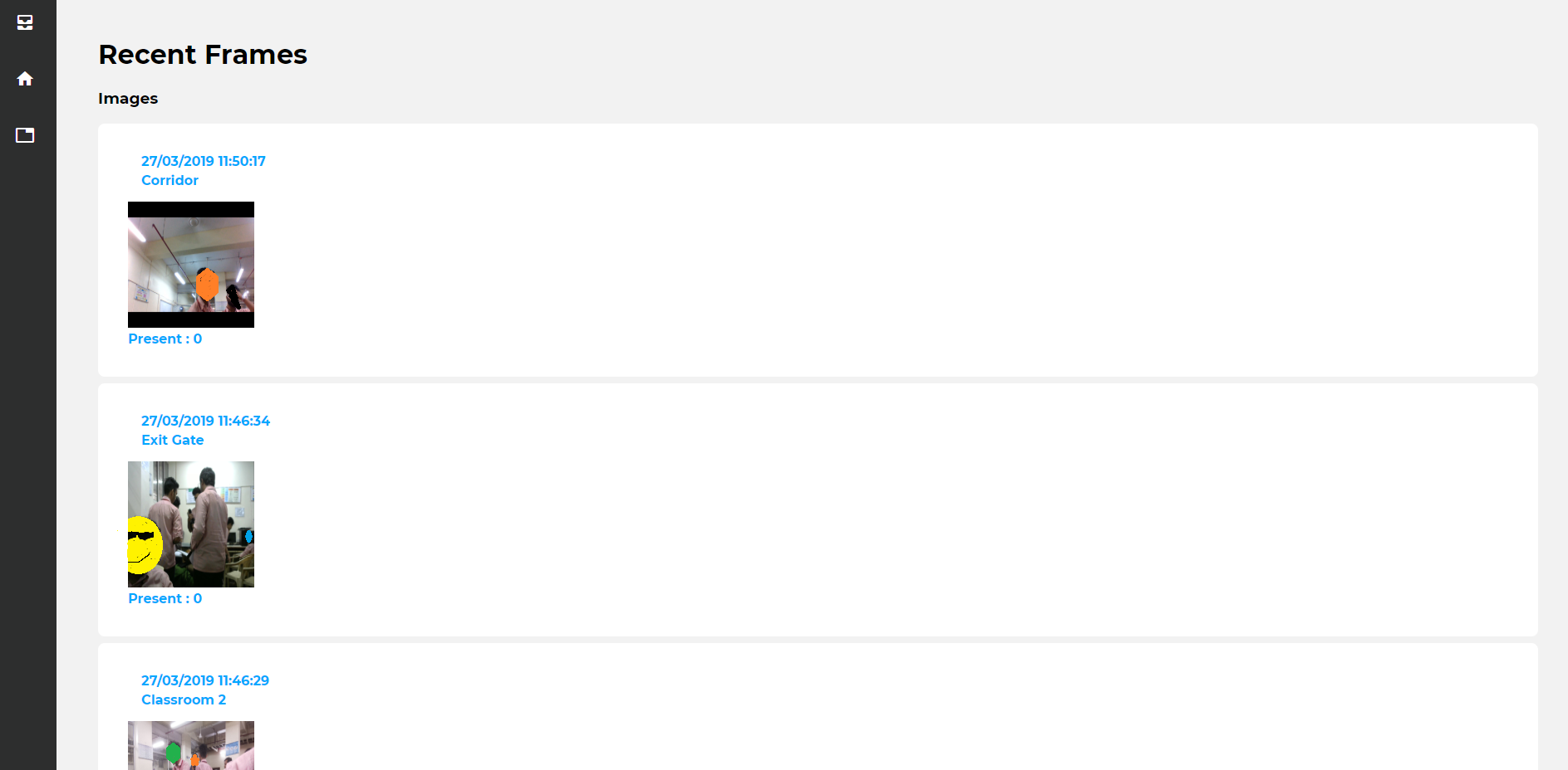
    Recent Images

    Shows the most recently captured images from all Camera Clients

    img

    Attendance Table

    Shows a list of all dates and number of present people, selecting one of them takes you to the next page.

    img

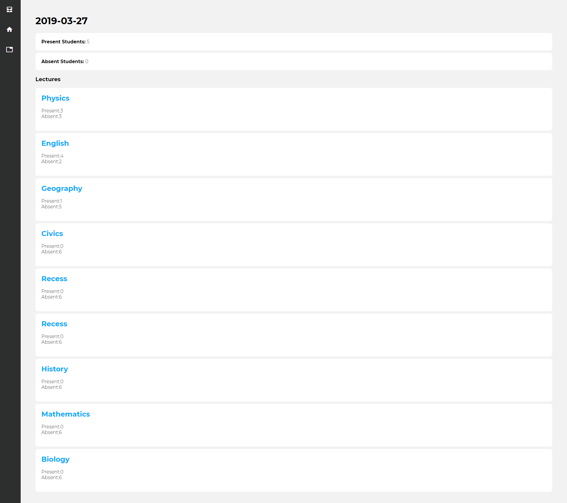
    Working Day Details

    Shows all of the lectures which were held that day in school, and how many people were present for those.

    img

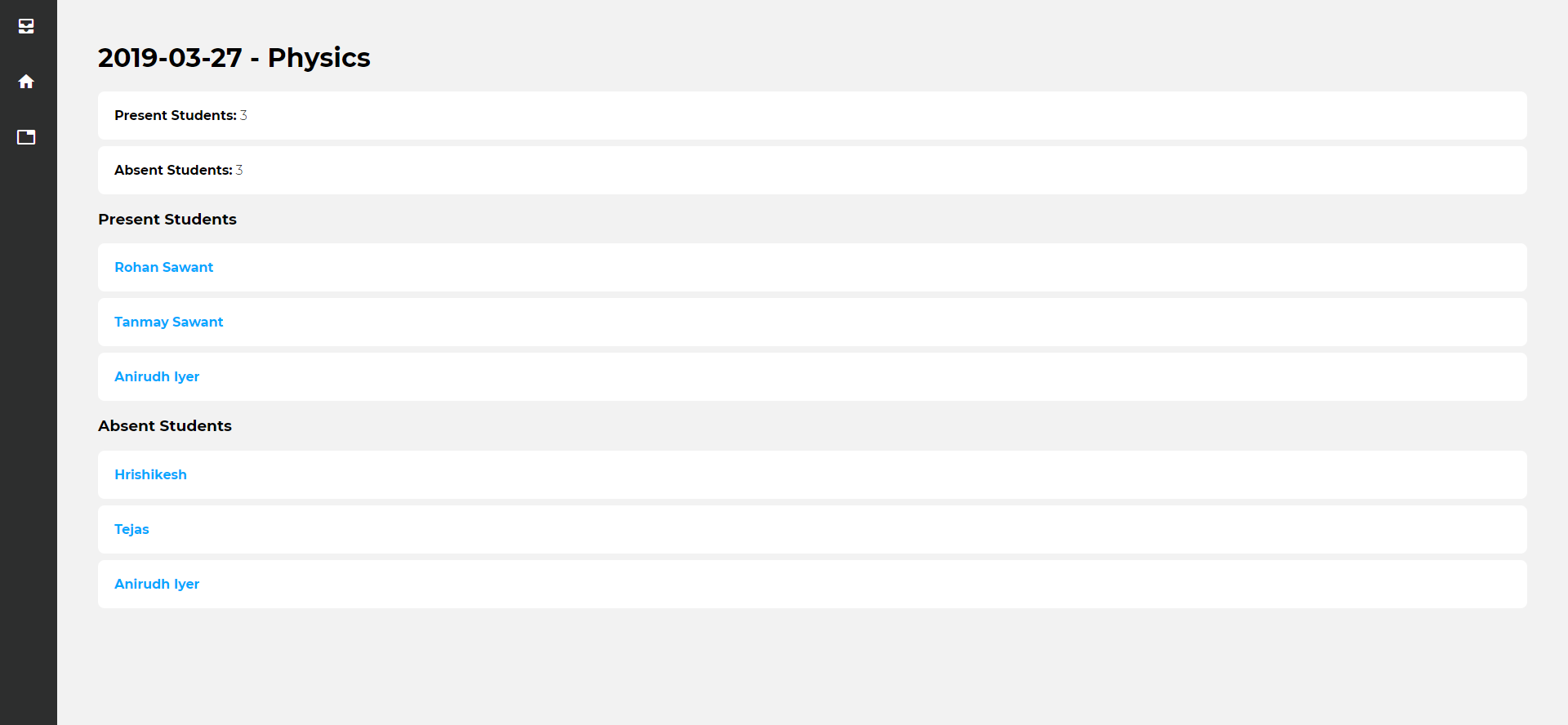
    Lecture Details

    Shows how many students were present for that particular lecture.

    img

    Hardware

    Raspberry Pi Zero – Camera Module

    Image

    Add a 5$ Case and Viola!

    Image

    How do I run it? — Ehh

    This is a high level description of what you could do, but feel free to hit me up on Hangouts at rohansawantct83@gmail.com if you are interested in getting something like this up and running.

    1. Setup Microsoft Face API
    2. Build OpenCV on a Raspberry Pi Zero
    3. Setup up Django Server on Heroku
    4. Setup Angular Frontend on Heroku
    5. Setup AWS S3

    Problem that I started out to solve

    Image

    On one rainy day in July, I dejectedly shook my head at the distressed professor who stared back at me, wondering where half of the class was? I shrugged helplessly, and went back to daydreaming about the Black Mirror episode which I watched earlier that day. The school had tried everything, taking attendance twice during lectures, making everyone sign a piece of paper passed around the class, fining for those who remained absent … you name it. All of these seemed like foolproof solutions to the problems according to the school’s middle management, me? I had my doubts.

    Lack of attendance in school during lectures…hmm, maybe AI could help me solve this, and helped me-solve-this it did, well at least on paper for the time being.

    YES! We could turn the college campus into a total surveillance state, monitor everyone, store everyone’s faces, track their every move, and use that to generate helpful insights to make the world a better place. 🙃

    That was how everything started, there are still a lot of features which I left unexplored, Face API also provides support for emotion recognition…

    Why? So we know our happy students from the sad ones?

    Maybe I could add activity recognition? That would help teachers pick the sleepiest of their pupils.

    :down-the-rabbit-hole: 🐇

    Moving on…

    Vision

    In my worst nightmares, I imagine a highly sophisticated version of this running running on embedded devices like the Nvidia Nano – on every street corner, every shop and every stop light, the data could be continuously stored in on the blockchain with no central point of failure, as we try and hope hard that our Funky-Glasses are enough to fool the cutting edge ML Models.

    Visit original content creator repository https://github.com/CT83/Facial-Recognition-Attendance-System
  • accessible-autocomplete-multiselect

    Accessible autocomplete multi select (RETIRED)

    NOTE: This project is retired as the component is not accessible.

    Similar functionality is now provided by the Multiple variant of the Select With Search component, which is available in the govuk_publishing_components gem.


    The accessible autocomplete is a component that helps users choose answers from a list you provide. You can also use it to make the answers you get from users more consistent.

    If you’re asking users to provide their country or territory, the govuk-country-and-territory-autocomplete might be more appropriate.

    npm version JavaScript Style Guide gzip size

    Sauce Labs Build Status

    This is a fork of the accessible-autocomplete component. It adds additional functionality such as support for select multiple.

    accessible-autocomplete is a JavaScript autocomplete built from the ground up to be accessible. The design goals are:

    • Accessibility: Following WAI-ARIA best practices and testing with assistive technologies.
    • User experience: Supporting a wide variety of user needs.
    • Compatibility: Working with recommended browsers and assistive technologies.

    Try out the examples!


    Support

    The GOV.UK Design System team maintains the accessible autocomplete as a standalone component. However, we’re only able to put in minimal work to support it.

    Read about our plans to maintain this component.

    Read more about the types of support we can provide.


    Installation / usage

    Using npm and a module system

    Install it by running:

    npm install --save accessible-autocomplete

    The accessibleAutocomplete function will render an autocomplete <input> and its accompanying suggestions and aria-live region. Your page should provide a <label> and a container element:

    <label for="my-autocomplete">Select your country</label>
    <div id="my-autocomplete-container"></div>

    Then import it using a module system like Browserify / Webpack / Rollup, and call the accessibleAutocomplete function, providing an array of values:

    import accessibleAutocomplete from 'accessible-autocomplete'
    
    const countries = [
      'France',
      'Germany',
      'United Kingdom'
    ]
    
    accessibleAutocomplete({
      element: document.querySelector('#my-autocomplete-container'),
      id: 'my-autocomplete', // To match it to the existing <label>.
      source: countries
    })

    If you want to use it as a replacement for a <select> element, read the Progressive enhancement section.

    As a plain JavaScript module

    You can copy the dist/accessible-autocomplete.min.js file to your JavaScript folder and import it into the browser:

    <script type="text/javascript" src="assets/js/accessible-autocomplete.min.js"></script>

    Styling the autocomplete

    A stylesheet is included with the package at dist/accessible-autocomplete.min.css.

    You can copy it to your stylesheets folder and import it into the browser:

    <link rel="stylesheet" href="assets/css/accessible-autocomplete.min.css" />

    You can also import it using Sass:

    @import "accessible-autocomplete";

    Using with Preact

    If you already use Preact in your application, you can import a bundle that will use that:

    import preact from 'preact'
    import Autocomplete from 'accessible-autocomplete/preact'
    
    preact.render(
      <Autocomplete id='autocomplete' source={suggest} />,
      document.querySelector('#container')
    )

    Try out the Preact example!

    Using with React

    If you already use React in your application, you can import a bundle that will use that:

    import React from 'react'
    import ReactDOM from 'react-dom'
    import Autocomplete from 'accessible-autocomplete/react'
    
    ReactDOM.render(
      <Autocomplete id='autocomplete' source={suggest} />,
      document.querySelector('#container')
    )

    Try out the React example!

    React versions

    React v15.5.4 has been tested to work with the Accessible Autocomplete – although make sure to check out documented issues.

    React v15.6.2 and 16.0 have been incompletely tested with the Accessible Autocomplete: while no undocumented issues were found, we recommend you carry out thorough testing if you wish to use these or later versions of React.

    API documentation

    Required options

    element

    Type: HTMLElement

    The container element in which the autocomplete will be rendered in.

    id

    Type: string

    The id to assign to the autocomplete input field, to use with a <label for=id>. Not required if using enhanceSelectElement.

    source

    Type: Array | Function

    An array of values to search when the user types in the input field, or a function to take what the user types and call a callback function with the results to be displayed.

    An example of an array of values:

    const countries = [
      'France',
      'Germany',
      'United Kingdom'
    ]

    If source is a function, the arguments are: query: string, populateResults: Function

    Similar to the source argument for typeahead.js, a backing data source for suggestions. query is what gets typed into the input field, which will callback to populateResults synchronously with the array of string results to display in the menu.

    An example of a simple suggestion engine:

    function suggest (query, populateResults) {
      const results = [
        'France',
        'Germany',
        'United Kingdom'
      ]
      const filteredResults = results.filter(result => result.indexOf(query) !== -1)
      populateResults(filteredResults)
    }

    Other options

    menuAttributes (default: {})

    Type: Object

    Sets html attributes and their values on the menu. Useful for adding aria-labelledby and setting to the value of the id attribute on your existing label, to provide context to an assistive technology user.

    autoselect (default: false)

    Type: Boolean

    Set to true to highlight the first option when the user types in something and receives results. Pressing enter will select it.

    confirmOnBlur (default: true)

    Type: Boolean

    The autocomplete will confirm the currently selected option when the user clicks outside of the component. Set to false to disable.

    cssNamespace (default: 'autocomplete')

    Type: string

    Use this property to override the BEM block name that the JavaScript component will use. You will need to rewrite the CSS class names to use your specified block name.

    defaultValue (default: '')

    Type: string

    Specify a string to prefill the autocomplete with.

    displayMenu (default: 'inline')

    Type: 'inline' | 'overlay'

    You can set this property to specify the way the menu should appear, whether inline or as an overlay.

    minLength (default: 0)

    Type: number

    The minimum number of characters that should be entered before the autocomplete will attempt to suggest options. When the query length is under this, the aria status region will also provide helpful text to the user informing them they should type in more.

    name (default: 'input-autocomplete')

    Type: string

    The name for the autocomplete input field, to use with a parent <form>.

    onConfirm (default: () => {})

    Type: Function

    Arguments: confirmed: Object

    This function will be called when the user confirms an option, with the option they’ve confirmed.

    placeholder (default: '') ⚠️ not recommended ⚠️

    Type: string

    This option will populate the placeholder attribute on the input element.

    We think placeholders have usability issues and that there are better alternatives to input placeholder text, so we do not recommend using this option.

    required (default: false)

    Type: Boolean

    The input field will be rendered with a required attribute, see W3C required attribute definition.

    showAllValues (default: false)

    Type: Boolean

    If this is set to true, all values are shown when the user clicks the input. This is similar to a default dropdown, so the autocomplete is rendered with a dropdown arrow to convey this behaviour.

    showNoOptionsFound (default: true)

    Type: Boolean

    The autocomplete will display a “No results found” template when there are no results. Set to false to disable.

    templates (default: undefined)

    Type:

    {
      inputValue: Function,
      suggestion: Function
    }

    This object defines templates (functions) that are used for displaying parts of the autocomplete.

    inputValue is a function that receives one argument, the currently selected suggestion. It returns the string value to be inserted into the input.

    suggestion is a function that receives one argument, a suggestion to be displayed. It is used when rendering suggestions, and should return a string, which can contain HTML.

    ⚠️ Caution: because this function allows you to output arbitrary HTML, you should make sure it’s trusted, and accessible.

    If your template includes child elements with defined foreground or background colours, check they display correctly in forced colors modes. For example, Windows high contrast mode.

    dropdownArrow (default: A triangle pointing down)

    Type: Function

    A function that gets passed an object with the property className ({ className: '' }) and should return a string of HTML or a (P)React element. ⚠️ Caution: because this function allows you to output arbitrary HTML, you should make sure it’s trusted, and accessible.

    Internationalization

    tNoResults (default: () => 'No results found')

    Type: Function

    A function that receives no arguments and should return the text used in the dropdown to indicate that there are no results.

    tStatusQueryTooShort (default: (minQueryLength) => `Type in ${minQueryLength} or more characters for results`)

    Type: Function

    A function that receives one argument that indicates the minimal amount of characters needed for the dropdown to trigger and should return the text used in the accessibility hint to indicate that the query is too short.

    tStatusNoResults (default: () => 'No search results')

    Type: Function

    A function that receives no arguments and should return the text that is used in the accessibility hint to indicate that there are no results.

    tStatusSelectedOption (default: (selectedOption, length, index) => `${selectedOption} ${index + 1} of ${length} is highlighted`)

    Type: Function

    A function that receives two arguments, the selectedOption and the amount of available options, and it should return the text used in the accessibility hint to indicate which option is selected.

    tStatusResults

    Default:

    (length, contentSelectedOption) => {
      const words = {
        result: (length === 1) ? 'result' : 'results',
        is: (length === 1) ? 'is' : 'are'
      }
    
      return <span>{length} {words.result} {words.is} available. {contentSelectedOption}</span>
    }

    Type: Function

    A function that receives two arguments, the count of available options and the return value of tStatusSelectedOption, and should return the text used in the accessibility hint to indicate which options are available and which is selected.

    tAssistiveHint (default: () => 'When autocomplete results are available use up and down arrows to review and enter to select. Touch device users, explore by touch or with swipe gestures.')

    Type: Function

    A function that receives no arguments and should return the text to be assigned as the aria description of the html input element, via the aria-describedby attribute. This text is intended as an initial instruction to the assistive tech user. The aria-describedby attribute is automatically removed once user input is detected, in order to reduce screen reader verbosity.

    Progressive enhancement

    If your autocomplete is meant to select from a small list of options (a few hundred), we strongly suggest that you render a <select> menu on the server, and use progressive enhancement.

    If you have the following HTML:

    <select id="location-picker">
      <option value="fr">France</option>
      <option value="de">Germany</option>
      <option value="gb">United Kingdom</option>
    </select>

    You can use the accessibleAutocomplete.enhanceSelectElement function to enhance it into an autocomplete:

    accessibleAutocomplete.enhanceSelectElement({
      selectElement: document.querySelector('#location-picker')
    })

    This will:

    • Place an autocomplete input field after the specified <select>
    • Default the autocomplete autoselect to true
    • Default the autocomplete defaultValue to the select’s option[selected]
    • Default the autocomplete id to the <select>‘s id
    • Default the autocomplete name attribute to '' to prevent it being included in form submissions
    • Default the autocomplete source to use existing <option>s from the <select>
    • Hide the <select> using inline display: none
    • Set the <select>‘s id to ${id}-select to decouple from any <label>
    • Upon confirming a value in the autocomplete, update the original <select>

    This function takes the same options as accessibleAutocomplete, with the only difference being that it uses selectElement instead of element, which needs to be an instance of HTMLSelectElement.

    Note: The accessibleAutocomplete.enhanceSelectElement function is fairly light and wraps the public API for accessibleAutocomplete. If your use case doesn’t fit the above defaults, try reading the source and seeing if you can write your own.

    Null options

    If your <select> element has a “null” option – a default option with no value – then you can pass a defaultValue option to enhanceSelectElement which will replace the label of this option when it is selected.

    With the following HTML:

    <select id="location-picker">
      <option value="">Select a country</option>
      <option value="fr">France</option>
      <option value="de">Germany</option>
      <option value="gb">United Kingdom</option>
    </select>

    Then passing a defaultValue option of '' will then leave the autocomplete blank if the null option is selected.

    accessibleAutocomplete.enhanceSelectElement({
      defaultValue: '',
      selectElement: document.querySelector('#location-picker')
    })

    Any null options will also be filtered out of the options used to populate the source of the autocomplete element. To preserve options with no value in the autocomplete, then pass a preserveNullOptions flag of true to enhanceSelectElement.

    Analytics and tracking

    The following events get triggered on the input element during the life cycle of the autocomplete:

    • onConfirm – This function will be called when the user confirms an option, with the option they’ve chosen.

    Example usage:

    accessibleAutocomplete({
      // additional options
      onConfirm: (val) => {
        track(val)
      }
    })

    Why another autocomplete?

    accessible-autocomplete was built after studying many existing solutions and prototyping patches to fix user experience or accessibility issues. It draws heavy inspiration from the following (and a lot of others):

    Developing locally

    Check out the CONTRIBUTING guide for instructions.

    If you want to help and want to get more familiar with the codebase, try starting with the “good for beginners” issues.

    License

    MIT.

    Visit original content creator repository https://github.com/alphagov/accessible-autocomplete-multiselect